So, I think I may have worked out how to add proper game-state saving in Runic Alchemy, and how to include sound effects, so I’m pretty stoked about all of that. I haven’t had a chance to implement any of it yet, but both have been on my back burner and worrying me a bit, so that’s a bit of a load off if it actually works.
One of the other issues that I’ve been a bit concerned with is being able to produce proper 2d art assets for the game. Obviously I’ve been going through all of this drawing practice to help get myself up to snuff for exactly that sort of thing, but to this point it’s been mostly focused on general drawing and figure drawing. Game assets require a slightly different focus, even if they are using many of the same skills. So to that end I picked up another Udemy course specifically on creating art assets for games, which I think will be incredibly helpful, while still helping to advance my drawing skills, so you should probably expect to start seeing slightly different subject matter in my daily drawings. I still need to learn the figure drawing, as that’s going to be hugely important, but the need for nice looking navigation buttons is a bit more pressing at the moment.
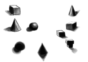 That being said, today I spent some time in my original Udemy drawing class, actually doing the homework for once. This image is the result, a study in basic shapes with form from light values and rendered shadows. I know I’ve posted things like this before, but these things do take practice, and dang it that’s what I drew today.
With so much work going into the game these last few days, I’ve managed to get very little in the way of actual sleep, so today’s video update is a bit of a short-cut post, in that I didn’t actually record any video. It’s all audio and images, but an update is an update, and I decided both that something is better than nothing, and that I really wasn’t up for an actual full video this evening. So there you go!
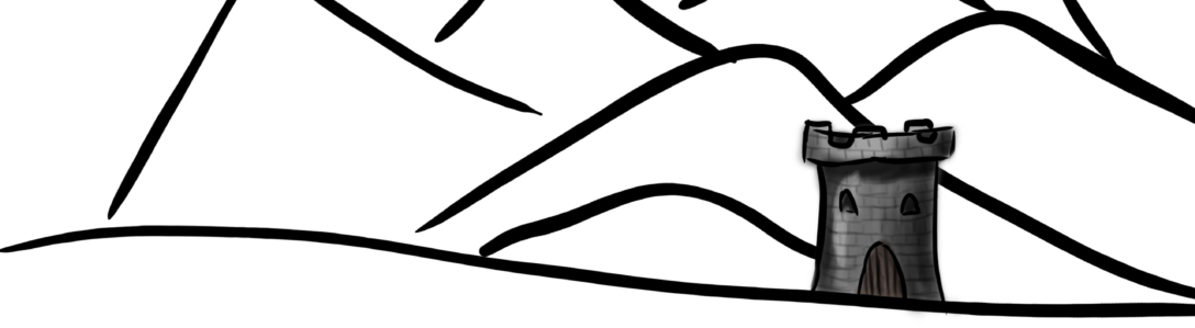
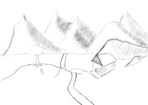
 I wanted to go super minimal with it, an impression of a landscape more than the actual thing, with the nice, thick and tapering lines in black and white. It’s kind of representative of the journey itself, a lot of land to traverse, and so much potential in the crossing. Increasingly difficult peaks to scale in the distance. For contrast, and to indicate a small amount of progress on conquering that canvas, I put in a rendered tower in the distance, part of the Illustrious Kingdom I’m trying to reach. I think as time goes on I may update the image further, incorporating new elements into the canvas as my skills grow and evolve.
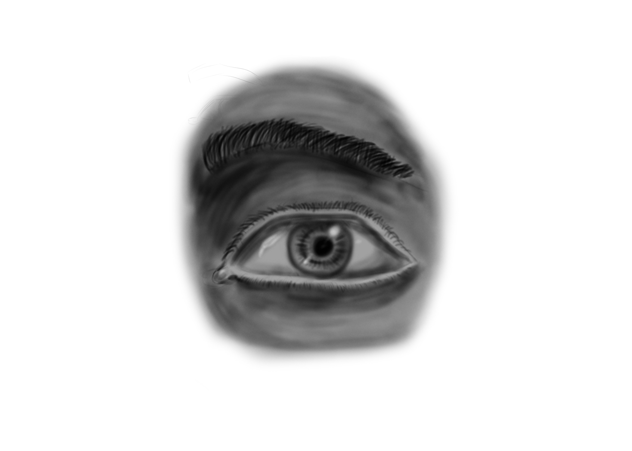
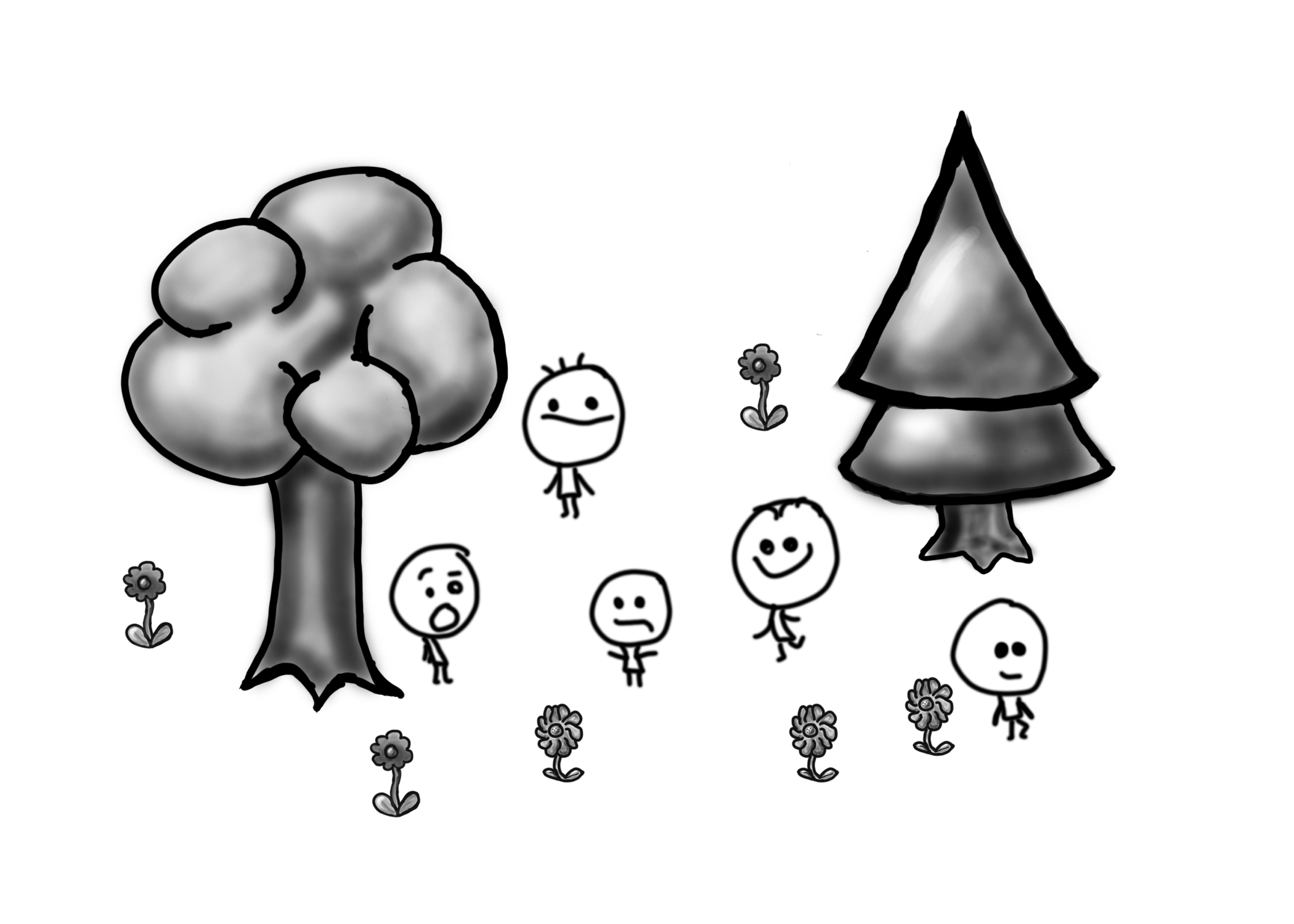
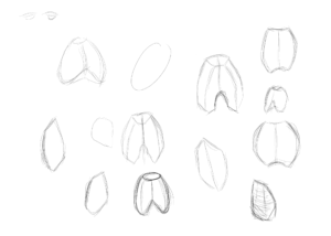
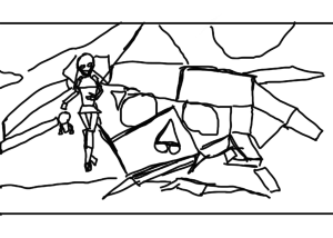
 As far as the actual drawing goes, the part of thirty minutes that wasn’t devoted to drawing random lines and circles, or playing around with the various Photoshop brushes went into this doodle. It’s not without its learning merit, though, for most of it I was paying particular attention to trying to change my go-to style and improve my line art. I tried to stay away from being overly sketchy, and stuck to a single brush size and no eraser. The only line variation is from the pressure sensitivity on the tablet being assigned to the brush transfer, so it’s more or less a standard mechanical pencil.
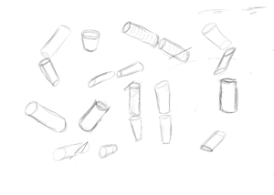
 Due to a missing stylus, I didn’t have access to my regular drawing tablet today, and ended up drawing on my android tablet instead, using Adobe Sketch. Aspect ratio doesn’t match my normal, but even so, I think the results are pretty good.
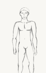

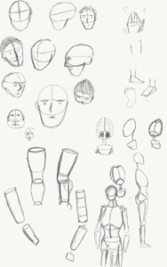
 I did a few more of the Loomis heads today, because I do still believe that putting a strong focus on the figure drawing is going to be really beneficial, since that’s one of my main goals. That said I also realized that I’ve been neglecting my basic drawing class, and that it would probably be a good idea to master the basics before spending too much time on the advanced. So, a little of both then.
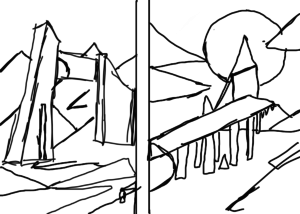
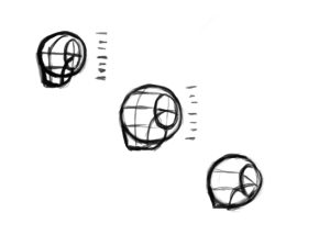
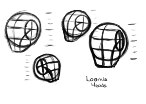 As intended, today’s drawing practice was much more focused and deliberate. Precisely four “Loomis” heads, so named after the creator of the technique: Andrew Loomis. Or at least something similar to his technique, anyway. The idea is to simplify the head into a round head shape and a squarish jaw area. The circle of the head is cut off and flattened at the sides by an ellipse, and the size and angle of the ellipse can help not only locate where to draw the jaw and front plane of the face, but also gives a sense of dimensionality to the form, indicating the tilt and angle of the head. I need to keep practicing the head to make sure I can get it just right from multiple angles, and to help improve so that maybe I won’t average ten minutes to draw an over-simplified head shape. I’m already moderately certain that I put the chin line too low on pretty much all four of these. But then, that’s the point of practice. You have to do it wrong before you can learn to do it right.